Jump to content

ValhallasAshes

Members
  • Posts

    10
  • Joined

  • Last visited

1 Follower

Recent Profile Visitors

The recent visitors block is disabled and is not being shown to other users.

ValhallasAshes's Achievements

Rookie

Rookie (2/14)

  • Collaborator Rare
  • One Month Later
  • Week One Done
  • Dedicated Rare
  • Reacting Well Rare

Recent Badges

19

Reputation

  1. Thank you Velkus. I really appreciate the share and the ping.
  2. That's really good. Any chance you could share that one?
  3. I would also consider RAM usage (utilization vs capacity) to be of high usefulness too.
  4. Yes, system fan in my template is referring to my chassis fans as controlled by my Lian-Li L-Connect 3 software. I have no idea what that bar in the Fans & Pump section in the image you posted is for...Fan speed percentage maybe? Loop fluid temperature? Not sure, but it looks like filler to me. Probably just to not leave a blank space. As for what they did to their template as a whole, it simply looks like mine but with using the standard font instead of the GeForce font. Other than re-adding the date to the top bar and the changed fan/pump entries, it looks like a 1:1 of my template. I hope this helps.
  5. This is really cool. My partner is going to love this one as she is a huge Fallout fan. My only critique is I wish you had used a generic brand neutral icon for the GPU section instead of the Nvidia logo. I have an Nvidia GPU, but my partner doesn't. It's for reasons like that I generally try to avoid hardware specific branding in sensor panels. But my partner would love this panel, so I'm going to have to try to find an alternative icon for that section for her. Thank you for sharing this panel. I know it sounds like I'm nitpicking, but you really have done a great job on it.
  6. Hello ValhallasAshes. What a coincidence. I also really liked the look of this panel and like you I want to get a Wigidash. The whole time I was wondering whether I should adapt this panel to the Wigidash or use a suitable one. But customizing it myself takes a lot of time. Thank you for doing this already. In red and a bit more transparent like here : (

    ) would look sick. I hope you find time to make other colors. Thank you very much

    1. ValhallasAshes

      ValhallasAshes

      Sorry for the delay in response.  I was setting up new speakers for my PC yesterday and was playing Anno 1800.  Thank you for the supportive comments.  I might do it in another color in the future, but it may be awhile.  I really like that one you linked though, I just wish they hadn't taken the download down.  I really like how they used a gradient on the red bars next to each title where each bar down gets darker and darker.  That's a really good idea and looks great.  I'll keep note of that for the future. 

      The AMD branding has to go though.  I have nothing against AMD (I'm running a 7950X myself), but I don't like "branding" in sensor panels because....what if I upgrade my hardware in the future (which I will).  Do I really want to go through the hassle of updating all the brands in my sensor panel every time I swap hardware?  No.  And I like all hardware manufacturers (except Gigabyte.  Don't get me wrong, their products clearly have good specs, but their quality control and customer service are among the worst in the industry.  In 20 years of building, I've had more problems with Gigabyte than any other manufacturer by far.  So I refuse to buy them now.  And Roccat  Apart from those two, everyone's fair game).  So I'm not a fanboy who's going to lock themselves to one brand every time I upgrade something.  So apart from typing my current spec into the titles myself, I prefer to keep my sensor panel completely branding neutral. 

      As for time to convert a sensor panel for a different resolution.  I won't lie.  It's not a "fast" process, but it only took me about a day to convert that panel for the Wigidash, between rescaling, touching up the pixels in photoshop and then realigning all of the elements.  About 8 to maybe 10 hours total.  Then a couple hours on a different day to add the CPU thread bars.  Which is when I posted it.  Then over the next couple days of use, tweaked a few alignment issues I noticed over time and fixed a scaling issue that was bugging me.  Each one of those, taking no more than about 10 minutes at a time as I noticed them.  Which is when I updated/posted the final version on the site.  So it really wasn't that bad.  And I'm no artist.  My photoshop skills are stupidly basic at best.  I basically just used resize (scaling down from a higher resolution instead of up from smaller resolution for quality reasons), used the eye dropper to color match and the bucket to pixel fill and that's pretty much it.


      As for the Wigidash, it's great!  I really like it.  But it does really need Aida64.  I don't really like the tiles they used in it's base form, but using Aida64 with it works fantastically.  The only downside though is I can't set Aida64 to boot with the computer.  For some reason Aida64 will not automatically re-apply the sensor panel on system startup.  Saying it failed.  My best guess is it might either be because Aida64 is loading in before the Wigidash manager software (Wigidash software is required for Aida64 to work with the sensor panel), or whether or not it's starting with windows with admin privileges or not.  All I know is, if Aida64 starts with windows, it won't load the sensor panel, forcing you to close and reload Aida64 to fix it.  So I've just stopped Aida64 from starting with windows. I let Wigidash and RTSS load automatically with windows and then I start Aida64 manually myself each time I log in. 

      But I think it's worth it.  It works great and does exactly what I want it to do.  And the best part, I don't have to mess with nor worry about managing multiple screens like I would have to using the other HDMI based models that are currently all over the internet.  Being able to have the sensor panel work independently from the rest of the desktop space due to it entirely using USB is really nice for many reasons, including compatibility reasons, such as some displays simply do not play nice together when plugged into the same video card.  And especially while gaming where you don't have to worry about accidently moving the mouse off screen onto the sensor because you moved the mouse to the wrong corner.  So for ease of use and piece of mind, the USB interface is a big plus.  Just fair warning, watch out for that resolution mismatch between what G.Skill advertises and what Aida64 detects, because it will throw your alignments off and you will need to add offsets in your panel to compensate for it.

      I hope this helps.


      P.S. This message was originally intended to be sent a couple days ago, but Aida's site went down right as I attempted to send it and didn't come back up until some point a day later.  TBH, I'm surprised it actually managed to recover the original message, but I'm glad it did.  So glad I don't have to rewrite it.

    2. Valwyg

      Valwyg

      No problem. The branding wasn't that important to me either. And I was already aware that adjusting the resolution is time-consuming. Btw, thanks for the tips with the Wigidash. It's weird that it doesn't recognize and adopt Aida64 afterwards. 
      The fact that it runs via a USB connection is also a blessing. That was also an argument what 8auer (Youtuber) said. I only found this practical device through him. I was looking for such a display anyway, where you can run the sensor panel on it. Suddenly I see the video from 8auer about Wigidash.

      I also noticed that the Aida servers were down. Thanks again for sharing your version. My skills in Photoshop are also very limited and it saved me a lot of time. I will check back from time to time to see if you have published a new version. 

      Regards

  7. I actually found 4 variants of that display and posted a reply to him. But because I included direct links to the comments in this thread that have that display, it's stuck in a "waiting for approval" state.
  8. That's the one from the Derbaur video. Yeah I tried to find that one too. Couldn't find it. EDIT: Found it! Google searched your image and found several versions of it: Do remember that Roman did say he customized it to his needs. So you're not likely going to find an exact match. But these are the ones that most closely match what you're looking for: https://forums.aida64.com/topic/667-share-your-sensorpanel/?do=findComment&comment=42963 https://forums.aida64.com/topic/667-share-your-sensorpanel/?do=findComment&comment=54446 https://forums.aida64.com/topic/667-share-your-sensorpanel/?do=findComment&comment=50178 https://forums.aida64.com/topic/667-share-your-sensorpanel/?do=findComment&comment=50543 I hope this helps.
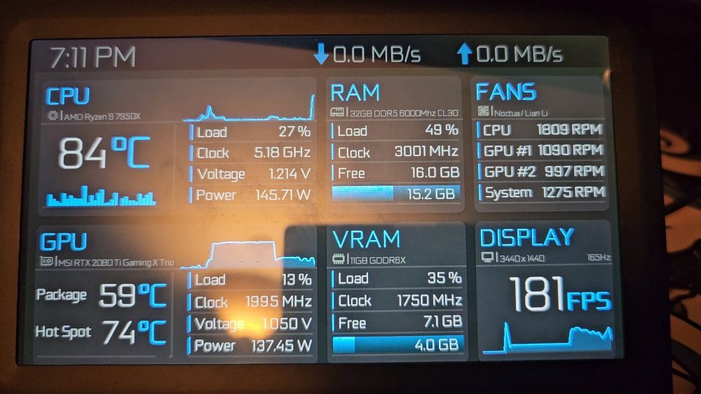
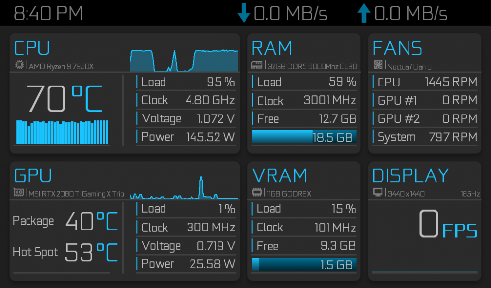
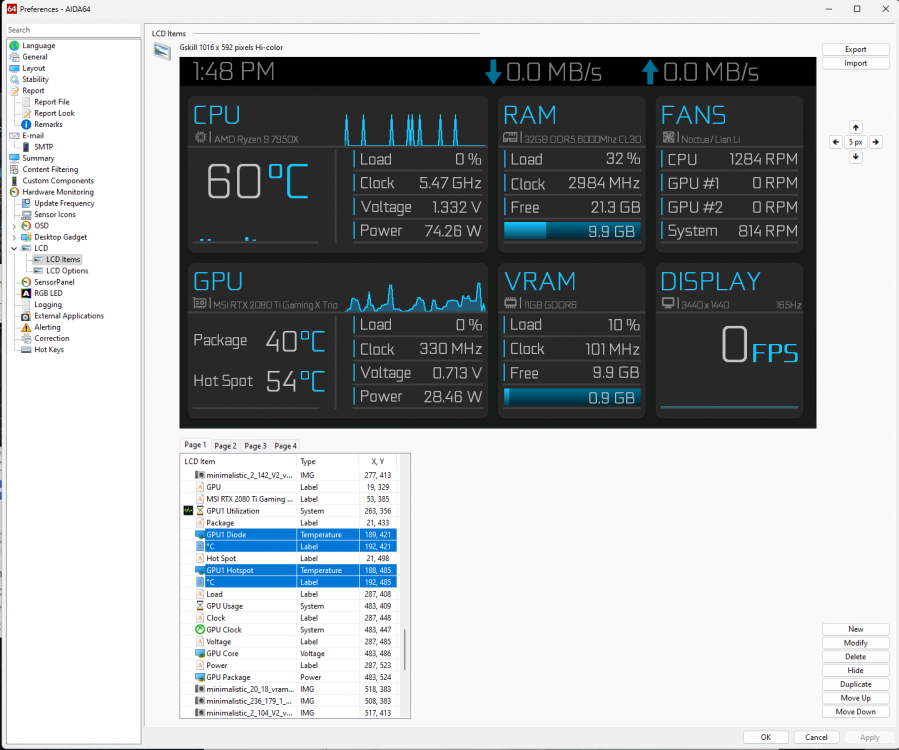
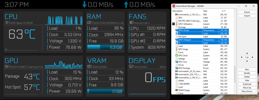
  9. I hope you don't mind. I really liked your sensor panel, but needed it in a 1024x600 format to work with my G.Skill WigiDash. I used the 1920x1080 version as my baseline and I had to manually edit and touch up each of the elements to make it work with the smaller screen. I did make a few alterations to better suit my needs though. Such as I didn't really need to have the min/max icons and info for the CPU and GPU. So in the CPU section, I replaced those with individual skinny bars for each of the logical threads on my CPU. So on the top right, I kept the area graph for the overall CPU usage, but under the CPU temp, I have usage bars for all of the CPU cores/threads. And in the GPU section, I traded the min/max temp identifiers for a GPU Hotspot reading. I had a recent issue with my GPU where the package reading kept saying the GPU was operating at safe temps, but my GPU would constantly over rev at full pelt. It wasn't until I checked the Hotspot temp that I found the GPU had a Hotspot temperature delta of well over 40 degrees hotter than the package temp. For reference, the Hotspot should be less than half that delta. A massive difference that it never should've been, pushing the GPU to well over 100 degrees under full load. That information, had I known it earlier, would've prompted me to replace the thermal paste years ago, but due to my only knowing about the standard temp reading, I relied on that reading to assume that the card was operating normally even though my gut told me something was wrong. Even MSI when I called them about it, told me it was probably just a defective sensor. Turned out the opposite was true. The card knew exactly what was wrong. Afterburner just never showed that sensor's reading to me. Replacing the thermal paste fixed that issue and the card now runs the way you would expect it to. Thankfully due to my paranoia during the issue, as a precaution, I ran the GPU for years undervolted to keep the fans from over revving. That must've been just enough to keep the card from cooking itself to death until I could find the cause of the problem. As a result of that experience, I now consider the hotspot temp to be a critical piece of information. So I replaced your min/max values with that reading instead. I saw someone else asking for the 1024x600 version of your minimalist sensor panel, but for the life me, I can't find it again. So I thought I would post it here in case anyone else wanted it. I hope you don't mind. As mentioned, I originally needed this for my G.Skill WigiDash sensor panel. Before anyone asks, no I don't have two GPUs. My GPU simply has two separate fan controllers. Hence the two GPU fan readings. I'm going to upload two different files. One is the standard 1024x600 version of the sensor panel and you will be able to know which one it is by it having the .sensorpanel extension at the end of it's file name. The other file I'm going to upload is a version specifically for the G.Skill WigiDash and you will be able to know which one it is by it having the extension .gslcd at the end of it's file name. While yes, technically both files can be imported and will work for either the standard sensor panel function or Wigidash (LCD section of Aida64), the reason I've done two versions is due to a technical discrepancy between what G.Skill marketed the screen's resolution to be and what Aida64 detects the screen's resolution to be. G.Skill originally advertised the WigiDash to have a resolution of 1024x600, but in practice, Aida64 recognizes the screen as having a resolution of only 1016x592. A discrepancy that does affect the alignment of the sensor panel on the WigiDash screen. So the .gslcd WigiDash version of the file includes offsets to compensate for the resolution mismatch to fix the panel's alignment. So make sure to download the version that's appropriate to your use case. Standard version (Final revision): Blue_Minimalist_1024x600_Rework.sensorpanel WigiDash version (Final revision): Blue_Minimalist_1024x600_Rework.gslcd GeForce Font: geforce_light.otf Thanks again to VeilSide for creating this incredible sensor panel. It's exactly the style I was wanting and with a few tweaks, it has all the information I wanted. Simple, clean, informative, looks great while being organized and easy to read. And completely unbranded. I love it. Great job Veilside, and I hope you don't mind me sharing a modified version of it. EDIT: Found a couple text misalignments. Fixed them and updated the files in this post. Also posted the GeForce Font file. Forgot to include that in the original post. EDIT 1/16/24: Adding this as a recommendation. The GPU package and hotspot temp reading felt way out of proportion to the elements around them. They were just way too big. So I've rescaled and realigned them a little to make them look better within the overall panel. Because I know most people edit all of the hardware titles and certain other elements to conform to their personal rig's specifications, I thought it would be easier for everyone who wants it to simply edit the 4 elements themselves rather than downloading new files and having to re-edit all of their hardware stats. So for those who've already downloaded the above files, here's some screenshots highlighting the 4 elements changed and those who want to can update their panels themselves relatively quickly: Standard Version: WigiDash Version: Simply change those four elements text size to 36 instead of 42 and adjust the x,y coordinates to match those shown in the image. Oh, and I also indented the Package and Hot Spot titles in a little bit. Their new x,y coordinates are also visible in the images. Then export to your chosen file to permanently save it. For those of you who'd rather just download the updated files without having to update them yourselves, I've already updated the main files so new downloaders get the latest version. Sorry if this update caused any confusion. It was just bugging me, and my OCD made me fix it. This will probably be the last update I do for this panel unless I think of a major change I want to make. But if that happens, I'll just make a new post next time instead of updating this one again. Maybe a different color like red, green, or purple. I kinda think a yellow/orange/gold version of this panel might look really good. I'll consider it if I have time.
×
×
  • Create New...