

Frustrated
-
Posts
6 -
Joined
-
Last visited
Recent Profile Visitors
1013 profile views


Frustrated's Achievements
")


-
I have the same problem with AIDA 64 Extreme v3.00.2500. So the problem is not isolated, but affects other users also. Need a stable version fix please. Going to try BETA July 9/13 release....
-
Hello Fiery, That update fixed the bug. It seems to display perfectly now. Thank you so much for fixing it.
-
Everest Ultimate Edition 5.30.1900
-
Hi Fiery, Thanks for the suggestion. I see you are the AIDA64 developer? I use a 27" LCD screen, and thus use 120DPI desktop font (instead of the standard 96 DPI font). The reason is that otherwise the icons would be too miniscule to read. I tried your suggestion of changing to standard font (96DPI), and then I also tried 144DPI to see what would happen. I use XP Pro SP3, and rebooted each time. The font in the tray icons in Everest, under any of the 3 resolutions tried, is very readable. Clarity and readablility is critical for the icons displaying critical info about your computer. Yes, the font runs off the right side of the Everest icons, but is still way more readable than the AIDA64 font. Actually the larger font is perfect, unless there is a period "." in the text, like in CPU speed. Because the icon can only handle 2 characters, not 3. In AIDA64, the font is distorted under all 3 resolutions tried. The font just gets larger or smaller with changes to the desktop font size, but equally distorted at all settings. Is there an easy font change setting somewhere that I can try? Since AIDA64 is a newer version of Everest, I do not understand why the icons differ so much in the new version. I could live with the smaller fonts, but need to lose the distortion and have a normal looking font in the icons. Is there a setting change I can try, or is this a bug? Any other suggestions to try? Your help is much appreciated. Thanks.
-
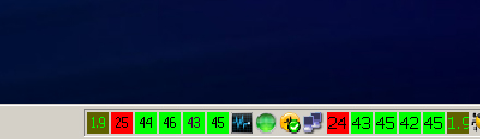
I am a user of Everest Extreme Edition. Now trying to migrate to laterst version of AIDA64 Extreme Edition. Having a problem with the tray icons, ones that show things like processor core temperatures. In Everest, the temperature numbers inside these icons were large and very readable. In AIDA64, the font is small and unreadable. So, how do I change the font type/size for these, so the icons are readable again? I can not see any way to do this ia AIDA64. But I am sure there is a way to do this. The attachment shows the AIDA64 icons on left side, and Everest icons on right side. The difference is HUGE! Help! Thanks.

-
New member here. Old user of Everest Extreme Edition. Now trying to migrate to AIDA64 Extreme Edition. Having a problem with the tray icons, ones that show things like mobo and processor core temperatures. In Everest, the numbers inside these icons which show the temperature number were large and very readable. In AIDA64, the font is unreadable. How do I change the font type/size for these, so the icons are readable again? The attachment shows the AIDA64 icons on left side, and Everest icons on right side. The difference is HUGE! Help! Thanks.