

Surjeet
-
Posts
354 -
Joined
-
Last visited
-
Days Won
93
Content Type
Profiles
Forums
Events
Everything posted by Surjeet
-
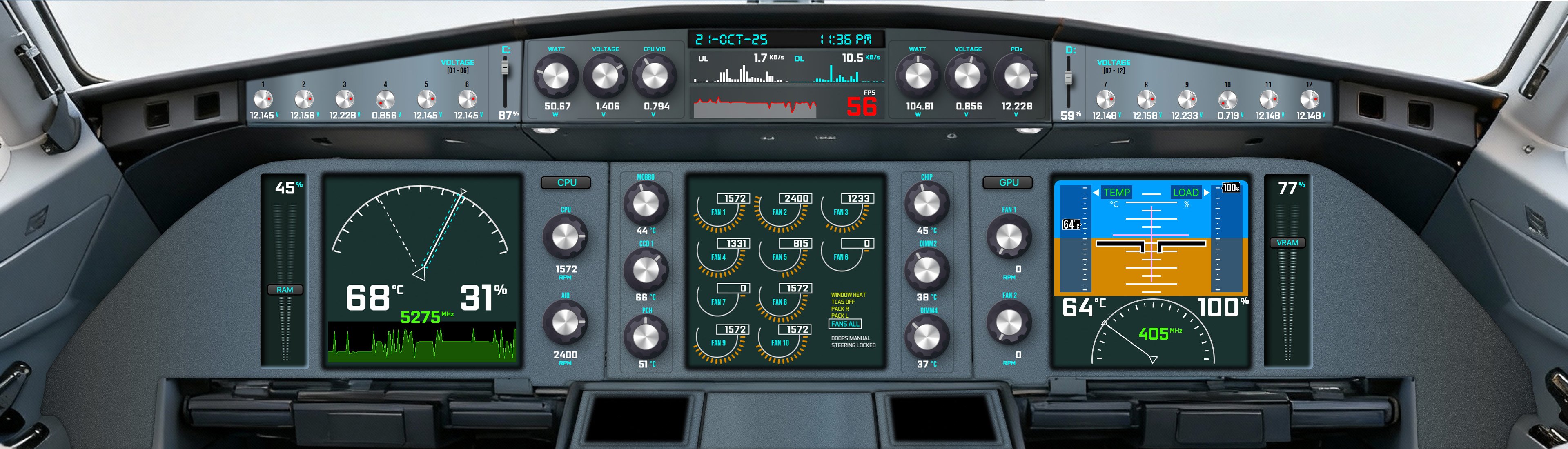
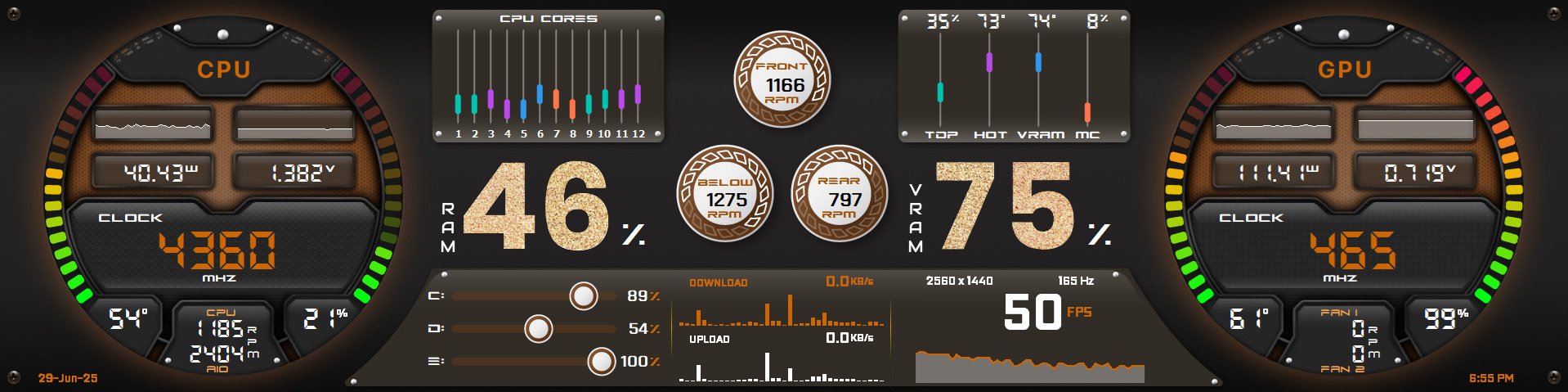
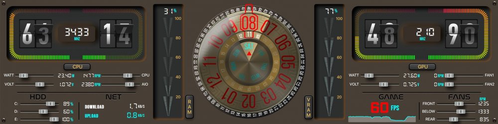
Tighten Your Seatbelts Again With "The Real Cockpit - 737"! A real Boeing 737 Cockpit-inspired masterpiece that doesn’t just monitor - it resonates with your system’s pulse. Size: 3840x1100 & 1600x1200 & 1920x480 (Created as per one user's special theme request!) Need a custom fit? No limits here! custom resolutions on request can be tries: 1280x800 | 1024x768 | 1920x720 | 1920x1080 & more! Precision > Taken Flight: Temperature: CPU | GPU: 100 States Utilization: CPU | GPU | RAM | VRAM: 100 States Please click here to send me a PM to claim your exclusive Sensor Panel. Step Into Tomorrow - Not just monitoring, it’s not just numbers - it’s your system’s heartbeat in motion. Explore more on my webpage: Surjeet Skins Performance. Perfected. Mastery Defined.

-
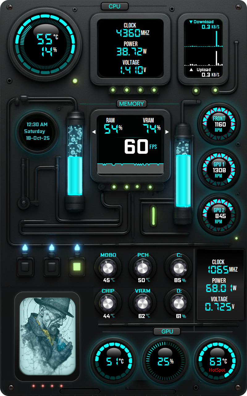
I Am the One Who Designs!! Custom Size: 800 x 1280 (Created as per one user's special theme request!) Gratefully inspired by the incredible panel styles of Costa Junior - with more exciting designs on the way! Huge thanks to @COSTAJUNIOR for the kind permission to explore and create in this amazing style. Truly appreciated! 🙏 Need another custom fit? we can try. Please click here to send me a PM. Command Reimagined. Control Redefined. Explore more on my webpage: Surjeet Skins Cooking Up Creativity to Say My Style!!
-
Tighten Your Seatbelts With "Lyrathon Sentrix - E9"! A cockpit-inspired masterpiece that doesn’t just monitor = it connects with your system’s pulse. Size: 1920x480 | 1280x400 Need a custom fit? No limits here! custom resolutions on request: 3840x1100 | 1280x800 | 1024x768 | 1920x720 | 1920x1080 & more! Please click here to send me a PM to claim your exclusive Sensor Panel. Step Into Tomorrow - Not just monitoring, it’s not just numbers - it’s your system’s heartbeat in motion. Explore more on my webpage: Surjeet Skins Performance. Perfected. Mastery Defined.

-
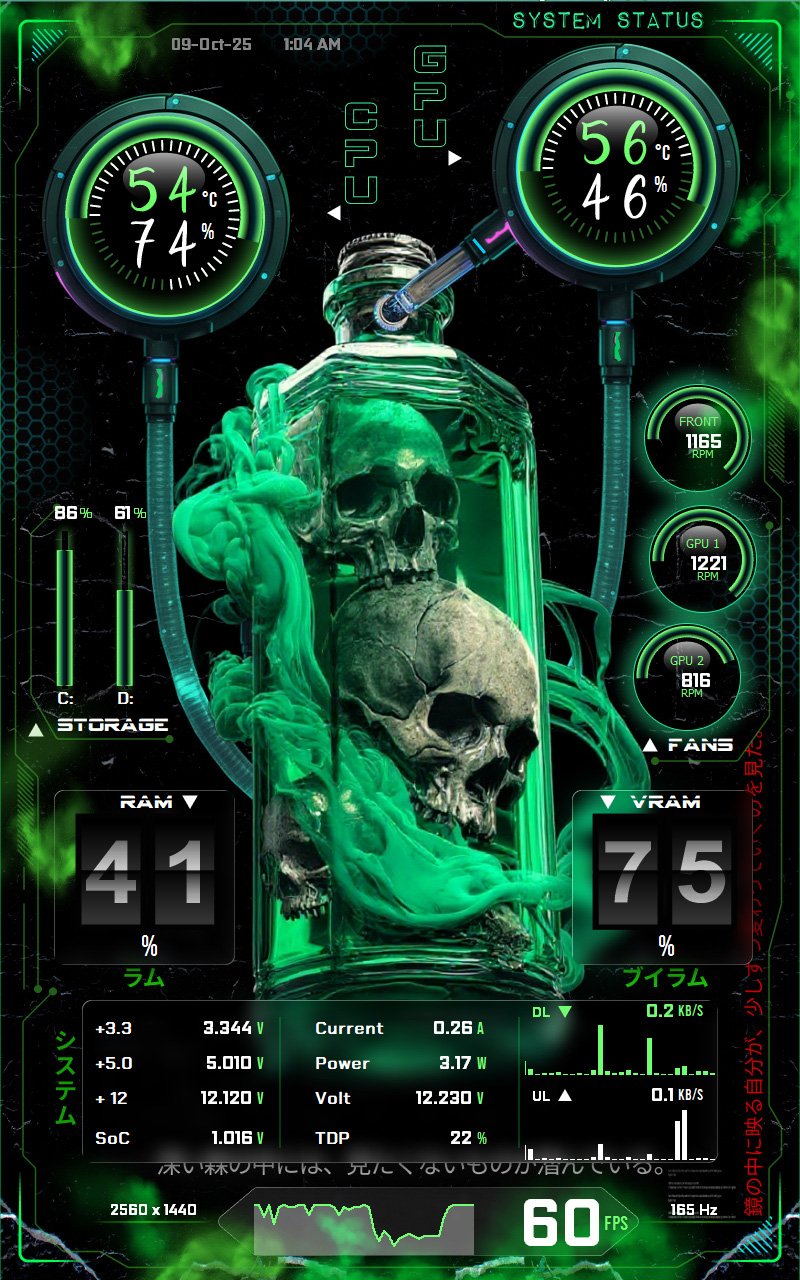
The Green venom aura: "Toxicum Coreline - V7"! Custom Size: 800 x 1280 (Created as per one user's special theme request!) Need another custom fit? we can try. Please click here to send me a PM. Precision > Elevated: Temperature: CPU | GPU: 100 States Utilization: CPU | GPU: 50 States Utilization: RAM | VRAM: 100 States Note: Requires AIDA64 v7.70.7500 or Beta v7.99.7829 or above. Please click here to send me a PM to claim your exclusive Sensor Panel. Command Reimagined. Control Redefined. Explore more on my webpage: Surjeet Skins Beyond Data - Where Design Breathes and Precision Lives!

-
@Fiery @Loyd Would it be possible to support opening multiple .sensorpanel or .spzip files at once? Not sure if this is the right place to ask apologies if not - but it seems like a useful feature for those working with multiple layouts. Appreciate any insights or workarounds. Thank you!
-
The Latest iOS-Inspired Glass Marvel - “Sci-Fi Hypercore – 26”! Size: 1920x480 Digital Instant Download:https://surjeetskins.etsy.com/in-en/listing/4377611149/aida64-sensor-panel-template-for-pc Need a custom fit? We've got you! Get personalized dimensions on request: 3840x1100 | 1280x800 | 1024x768 | 1920x720 | 1920x1080 & more! Precision, Perfected: CPU & GPU Temps/Utilization: 100 dynamic states bring real-time data to life RAM & VRAM Utilization: Mesmerizing bold, glassy numbers display memory usage with 100 states for unmatched clarity and flair Please click here to send me a PM to claim your exclusive Sensor Panel Step Into Tomorrow - redefine your setup with a fusion of uniqueness, precision, and artistic futurism. Explore more on my webpage: Surjeet Skins Beyond Data: both functional and beautiful!
-
The New Style: "Oblimach Varanum - C1"! Size: 1920x480 Need a custom fit? We've got you! custom resolutions on request: 3840x1100 | 1280x800 | 1024x768 | 1920x720 | 1920x1080 & more! Digital Instant Download: https://surjeetskins.etsy.com/in-en/listing/4361503226/aida64-sensor-panel-template-1920x480 Precision that matters: CPU & GPU Temperature: Razor-sharp accuracy across 100 thermal states in real time CPU & GPU Utilization: Dynamic live usage brought to life in 100 seamless states RAM & VRAM Utilization: Bold, vibrant numbers across 100 states - transforming memory into a visual masterpiece Chrono Core: A reinvented clock with revolving hours, minutes, seconds, and weekdays Note: Requires AIDA64 v7.70.7500 or Beta v7.99.7829 or above. Please click here to send me a PM to claim your exclusive Sensor Panel Step Into Tomorrow - Not just monitoring, but an experience that breathes with your system. Explore more on my webpage: Surjeet Skins Your Watchful Vision in the Digital Battlefield!
-
Introducing the different again: "Velorum Sentira - F2"! Size: 1920x480 Need a custom fit? We've got you! Get personalized dimensions on request: 3840x1100 | 1280x800 | 1024x768 | 1920x720 | 1920x1080 & more! Crafted for dreamers, Engineered for precision: CPU & GPU Temperature: 100 dynamic states with flipping number effects - instant, accurate, and beautifully color-coded CPU & GPU Utilization: Real-time usage - alive in 100 fluid states of precision with flipping numbers effects RAM & VRAM Utilization: Memory efficiency, visualized like never before with 100 states The New Looks Clock: - Revolving Hours, Minutes, Seconds & Weekdays with perfection! Note: Requires AIDA64 v7.70.7500 or Beta v7.99.7829 or above. Please click here to send me a PM to claim your exclusive Sensor Panel Step Into Tomorrow - Not just monitoring - an experience that breathes with your system. Explore more on my webpage: Surjeet Skins When Design Serves Power.
-
The Revolving Flipping numbers: "Oblivara Monolith - T8"! Size: 1920x480 and 1600x1200 Digital Instant Download: https://surjeetskins.etsy.com/in-en/listing/4361506330/aida64-sensor-panel-template-1920x480 Need another custom fit? Get personalized dimensions on request: 3840x1100 | 1280x800 | 1024x768 | 1920x720 | 1920x1080 & more! Precision > Elevated: Temperature/Utilization: CPU · GPU · RAM · VRAM: 100 States Real-time accuracy brought to life with bold, retro-inspired flipping numbers. Watch Hour Hand Mastery: Day(AM): 360 images Night(PM): 360 images A total of 720 images that makes the hour hand moves every 60 seconds, so it is perfect, flawless, accurate! HDD/FAN: Stats with color-shifting LED transitions - Armed with dual-state green/red alerts! Note: Requires AIDA64 v7.70.7500 or Beta v7.99.7829 or above. Please click here to send me a PM to claim your exclusive Sensor Panel Command the Future - A seamless fusion of innovation without compromise. Explore more on my webpage: Surjeet Skins Beyond Data - Turning Metrics into a masterpiece!
-
From Vigilance to Victory: "Cerberus Vortara - P5"! Size: 1920x480 and 1920x720 Need a custom fit? We've got you! custom dimensions on request: 3840x1100 | 1280x800 | 1024x768 | 1600x1200 | 1920x1080 & more! Precision that matters: CPU & GPU Temperature: Razor-sharp accuracy across 100 thermal states in real time CPU & GPU Utilization: Dynamic, real-time usage brought alive through 100 fluid states RAM & VRAM Utilization: 100 vibrant states with smooth motion, making memory monitoring a visual masterpiece Every metric pulses with stunning, color-shifting LED transitions - Armed with dual-state green/red alerts! Please click here to send me a PM to claim your exclusive Sensor Panel Step Into Tomorrow - where innovation, precision, and futuristic design unite. Explore more on my webpage: Surjeet Skins Beyond Data - When Design Serves Power!
-
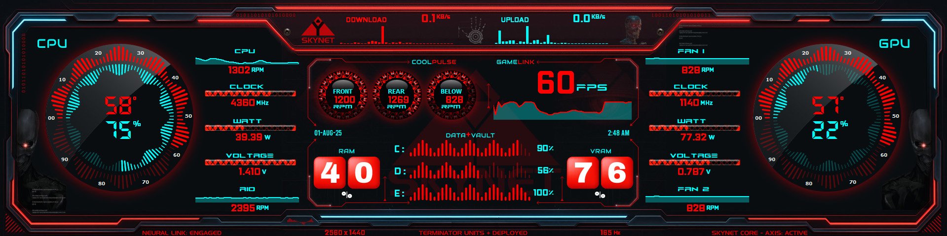
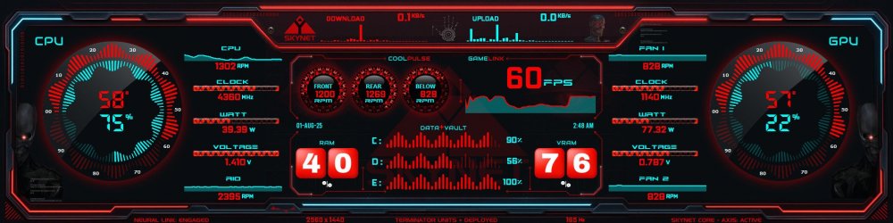
Deploy the Future: "Neural Vigilo - T3"! Size: 1920x480 Digital Instant Download: https://surjeetskins.etsy.com/in-en/listing/4345810527/aida64-sensor-panel-template-skynet Custom Sizes Available: 3840x1100 | 1280x800 | 1024x768 | 1920x720 | 1920x1080 - and more on request. Crafted for visionaries. Engineered for precision: CPU & GPU Temperature: Monitor in real time with razor-sharp accuracy across 100 dynamic thermal states CPU & GPU Utilization: Witness performance in motion - 100 precision-tracked levels in a design born from the future RAM & VRAM Utilization: Big numeric indicators deliver clarity, reflect memory behaviour with exacting beauty with 100 states Please click here to send me a PM to claim your Neural Command Core Sensor Panel. Step Into Tomorrow - Redefine your system with a fusion of art, power, and cybernetic precision. Explore more on my webpage: Surjeet Skins Data||Reimagined. Emotion||Engineered.
-
The Neon Elegance: "CYNEQUA VIRELUM - G6"! Size: 1920x480 Need a custom fit? We've got you! Available in custom sizes: 3840x1100 | 1280x800 | 1024x768 | 1920x720 | 1920x1080 & more upon request! Innovation Where Precision Radiates: CPU & GPU Temperature: Real-time thermal intelligence across 100 bold states - digits that speak in degrees CPU & GPU Utilization: Experience dynamic performance tracking using 100 states - amazing looking bold numbers RAM & VRAM Utilization: Visually hypnotic neon waveforms & massive glowing digits - 100 fluid states of memory in motion. Please click here to send me a PM to claim your exclusive Sensor Panel Enter the Future - Where Tech Feels, Data Speaks, and Pixels Pulse with Purpose. Explore more on my webpage: Surjeet Skins Beyond Monitoring > It Connects > It Understands.
-

SensorPanel Manager: Smart Sensor Replacement (NEW Feature)!!
Surjeet replied to Surjeet's topic in SensorPanel
@Fiery, I am using build v 7.70.7500 and while using "Change Source", I observed the following: In Sensorpanel Manager: - Description/Label changed as per the new source/sensor - Type did not change and remained as per the previous sensor: For example below, I changed Volume to CPU Temperature, Type remained as System even after changing the source. It should appear as Temperature. I think something is missed in the new update, is it so? please check and let us know your observations!! Thank you!
-
Thank you for the update and considering this idea! We completely understand and will keep an eye out for when this improvement idea is implemented in the future!
-
Introducing the different: "Sci-Fi Prismata - G5"! Size: 1920x480 and 1600x1200 and 1920x720 and 2560x720 Digital Instant Download: https://surjeetskins.etsy.com/listing/4337175848 Need a custom fit? We've got you! Get personalized dimensions on request: 3840x1100 | 1280x800 | 1024x768 | 480x1920 | 1920x1080 & more! Crafted for dreamers, designed for precision: CPU & GPU Utilization: Real-time temperature and usage - brought to life through 100 states CPU & GPU CLOCK/Watt/Volt/Fans: Instant, accurate, and beautifully color-coded Please click here to send me a PM to claim your exclusive Sensor Panel Step Into Tomorrow - Step beyond ordinary. Embrace a new dimension of system monitoring. Explore more on my webpage: Surjeet Skins Beyond Data. Designed to Feel. I edited your post. According to the new rules, only one image is allowed since it’s the same skin. Please make sure to follow the rules.
-
Hi @Fiery, please let us know if this idea is worth and can be implemented. Even if it can not be implemented, we are good; however, need your final decision 🙏
-
REQUEST NEW FEATURE - Date in the Custom Gauge
Surjeet replied to Surjeet's topic in General Discussion
Thank you for the explanation! It makes a valid point👍 -
The Spectral Elegance: "Glaciorum Coreline - B6"! Size: 1920x480 Need a custom fit? We've got you! Available in custom sizes: 3840x1100 | 1280x800 | 1024x768 | 1920x720 | 1920x1080 & more upon request! Innovation That Feels Alive: CPU & GPU Temperature: Real-time thermal precision across 100 states with color transitions CPU & GPU Utilization: Dynamic performance tracking brought to life through stunning color transitions RAM & VRAM Utilization: Visually immersive, ultra-crisp, ultra-clear, ultra-beautiful Neon Big Numbers - 100 states of intelligent design Please click here to send me a PM to claim your exclusive Sensor Panel Step Into Tomorrow - Unleash the future where technology breathes, data glows, and every pixel connects emotion to precision. Explore more on my webpage: Surjeet Skins Beyond Monitoring > It Connects!

-
Unveil the Dawn of Brilliance: "Solstice Aegiron - B4"! Size: 1920x480 Need a custom fit? We've got you! Get personalized dimensions on request: 3840x1100 | 1280x800 | 1024x768 | 1920x720 | 1920x1080 & more! Innovation Meets Precision: CPU & GPU Temperature/Utilization: Real-time performance, brought to life with radiant, color-shifting transitions RAM & VRAM Utilization: Absolute clarity with 100 precision states and bold numbers Please click here to send me a PM to claim your exclusive Sensor Panel Step Into Tomorrow - Unleash the future of system monitoring - a seamless fusion of engineering, aesthetics, and sci-fi soul. Explore more on my webpage: Surjeet Skins Not just stats. This is data - Reimagined. Felt. Beyond.
-
REQUEST NEW FEATURE - Date in the Custom Gauge
Surjeet replied to Surjeet's topic in General Discussion
As for seconds, we always need lower update rate, can we make a separate entry for Time (Second) in "Update Frequency" so that the whole SensorPanel items are not refreshed/updated so quickly. What do you suggest? I guess, making lower update rate demands more resources? -
Thank you! 🙏 Thank you! 🙏 I agree and onboard that this feature will make things easy and attractive at the same time! Lets see, what @Fiery has to say regarding this new feature. If it is worth? do-able and can be implemented or not? Let's wait for his precious inputs. Fingers crossed 🤞
-
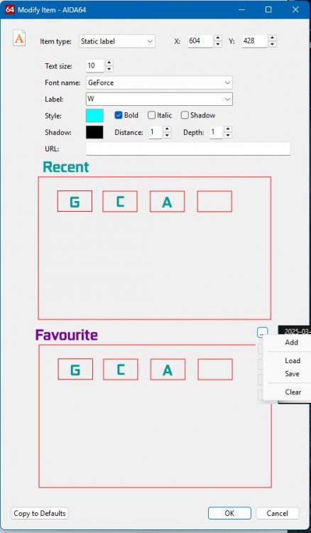
Hi AIDA Team, We all really LOVED the new colour picker dialogue which is an awesome feature addition to next generation of AIDA. I was thinking can we add something same for the Font picker too? Right now we have drop drop from where we need to use the font. Let the functionality remain the same. Here are a few suggestions that could enhance the Font Picker: Introduce sections such as "Recent Fonts" and "Favourite Fonts" with options to Add, Save, Rename, Delete, and Clear Display fonts using their initials (or small names/abbreviations in boxes, with customized names appearing on mouse hover Optionally, integrate these customized fonts into the Right Click Context Menu, similar to the one used in the Colour Picker - which is absolutely fantastic, by the way! @Fiery I completely understand that this could be a substantial and complex feature to implement. Still, I’d love to hear your thoughts, suggestions, or any feedback on the feasibility of this idea. Thank you so much for your continued efforts and brilliant innovations! Font Picker Enhancements Inspired by the New Colour Picker @COSTAJUNIOR @BHSY @JariKoi You all have been truly amazing with your support and feedback - thank you so much for that! 🙏 I’d really appreciate it if you could take a moment to check out this feature request and share your thoughts or suggestions as well. Your input would mean a lot!
-
REQUEST NEW FEATURE - Date in the Custom Gauge
Surjeet replied to Surjeet's topic in General Discussion
I simply checked the numbers for now. Hour, Minute came perfect and seconds were increasing perfectly. I will test it with images very soon. However, please feel free to share the BEST and the correct way to use and utilize it when you tested it. It will be of great help! Thank you! -
Thank you for fixing it. I tested and now its working perfectly in both Custom (16 states) and Custom(n States). Now images are accepted and arranged in ascending order PERFECTLY even without using "-" or "_". Thank you! 🙏
-
REQUEST NEW FEATURE - Date in the Custom Gauge
Surjeet replied to Surjeet's topic in General Discussion
WoW, Its PERFECT and FLAWLESS!! Now, we will see next generation level of sensor panels 🔥 Thank you! 🙏