

Arbit
-
Posts
55 -
Joined
-
Last visited
-
Days Won
7
Content Type
Profiles
Forums
Events
Everything posted by Arbit
-
Looks sweet. Im having trouble seeing your text. Where are the graphs? below the rtx and ryzen? At the bottom? I love the background.
-
I would change your sensor panel to be black and red to match your water-cooling loop. Overall, looks great.
-
There are many that are 1280 x 720. You can use any of those on your screen. Just set the correct size of the panel in the prefs.
-
I thought of making custom gauges using time. Unfortunately you would have over 6100 gauges stacked. Gauge icon 0 and 16 would be blank for all, and setting the minimum and maximum stepwise. To fill up the day at 86000ish seconds. Any other thoughts. Using any other sensor that fluctuates frequently (CPU temp) a gauge would have a jerky type movement.
-
I like it a lot. The brushed metal is a nice touch. Clean and clear.
-
Just go to your preferences and resize it to 515 x 1920. I have the same problem when I make changes from my work computer. My work and home displays are different resolutions. Once the display is resized you will have to move the elements into proper position. I look at many panels and download them. I often have to resize in the prefs of Aida64 and move the elements. Many are even off the screen. I think this should help.
-
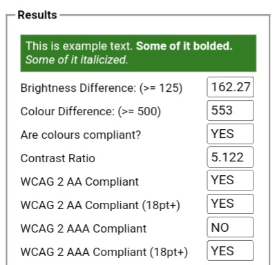
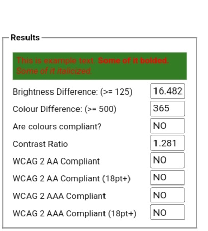
I'm noticing that many panels use background and text colors that are pretty close in contrast to each other that makes them almost unreadable. Text on a background should have contrast in brightness and color not compliment. If you have to squint to read it, it's no bueno! I'm no expert, but there are many color tools on the web that allow you to see if your chosen colors pass a simple readability test. The tools will specify readability above and below 18 point text for your monitor. Also it allows you to move sliders to pick possibly better colors for your panels legibility. Examples are below. From the site: The tool will indicate that the colours pass the test if both the colour difference and the brightness difference exceed their threshold. It will indicate that it sort of passes if only ONE of the TWO values exceed their threshold. And finally, it'll fail to pass if neither value exceeds its threshold. The tool will also indicate if the colours pass the newer WCAG 2.0 contrast ratio formula. The WCAG 2.0 formula differentiates between text smaller than 18pt text larger than 18pt (or text that is bold and larger than 14pt). For AA compliance, text should have a ratio of at least 4.5:1 (larger text, at least 3:1). For AAA compliance, text should have a ratio of at least 7:1 (larger text, at least 4.5:1). https://snook.ca/technical/colour_contrast/colour.html#fg=FFECEC,bg=337D24. This is one site, but there are many others. I hope it helps.
-
Just go to your preferences and resize it to 515 x 1920. I have the same problem when I make changes from my work computer. My work and home displays are different resolutions. Once the display is resized you will have to move the elements into proper position. I look at many panels and download them. I often have to resize in the prefs of Aida64 and move the elements. Many are even off the screen. I think this should help. Also, make sure you have the orbitron font set installed. I use the bold, semi bold, medium, and regular in this panel. If you need anything else, please let me know. Btw. There are 2 hidden objects in the panel. Both are guides for the network upload and download gauges. They should be set at the second arrow on the alignment bar when aligning at minimal or no download / upload speed. Just place the single sensor arrow over the second alignment arrow from the left and you should be set to go.
-
Here is the panel if anyone wants. 2023-03-03.sensorpanel
-
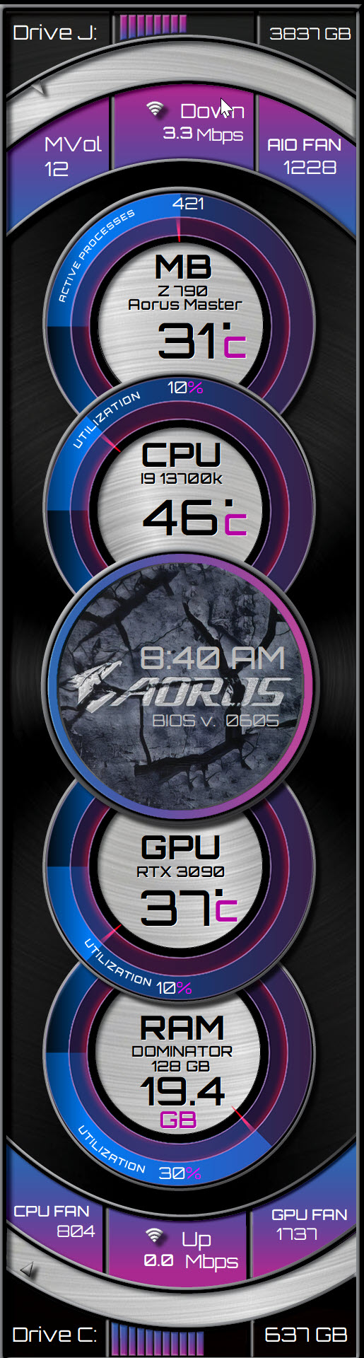
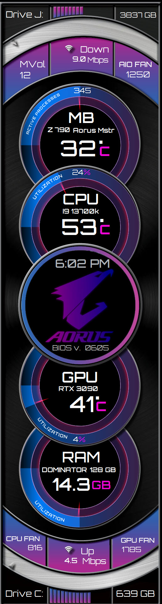
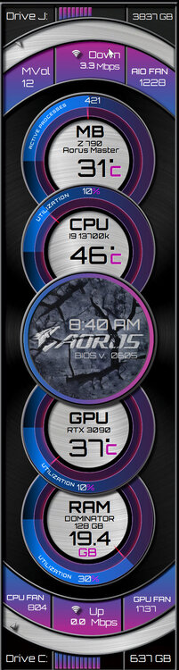
Added Hard Drive Utilization. I like clean clear panels. Is this too busy?
-
The gauges are made in illustrator. (The main ones were made by someone else) the artwork was made in Photoshop and all combined in InDesign. I can select whatever you want and export to a PNG. Because of the complexity of multiple overlapping layers some images must be placed separately in aida. If you have InDesign I can give you that file and you can turn on and off whichever layers you want. The hardest part was getting the single pointer dials for upload and download speeds on the gray bars. It was a PIA. It will be difficult to adjust and rotate 90 degrees.


-
I'm not sure I understand what you are asking. Screenshot and Circle what you want and I'll do the file.
-
You can modify this as much as you want. To do this was really time consuming and I'm happy to share but not revising for others screens. Besides, you might learn something as you do it. Good luck!
-
Here is my alternative panel. Font Orbitron. Thanks to Chino83 for his dials and inspiration. 1945017823_RockcenterGraybackground.sensorpanel
-
As soon as I can I'll post it. Thanks for your interest.

-
Its posted on page 388
-
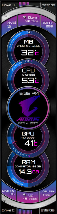
The Font is ORBITRON 2023-02-22.sensorpanel
-
What size in pixels are you looking for? Is this for a dial? Is it for an outline? I would google and search for an image of what you are looking for and share it here. I'm happy to make it for you.
-
I can send you mine and you can modify it to your hearts content.
-
There are a ton of posts about this. Corsair icue software is incompatible. Either remove the software or plug your fans into mobo connectors. It's Corsair causing the problem.
-
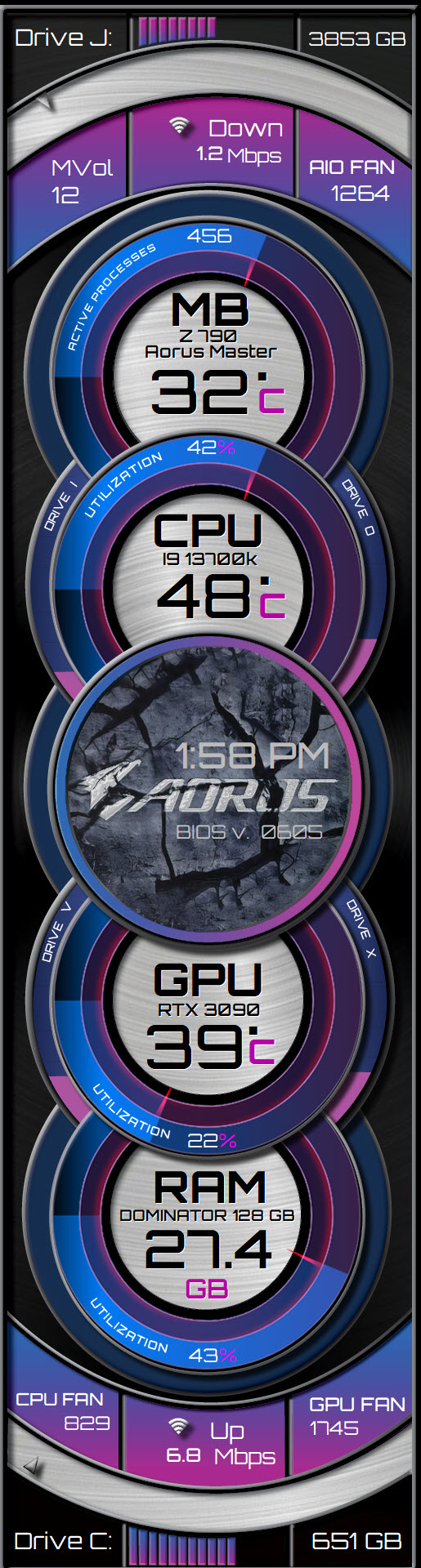
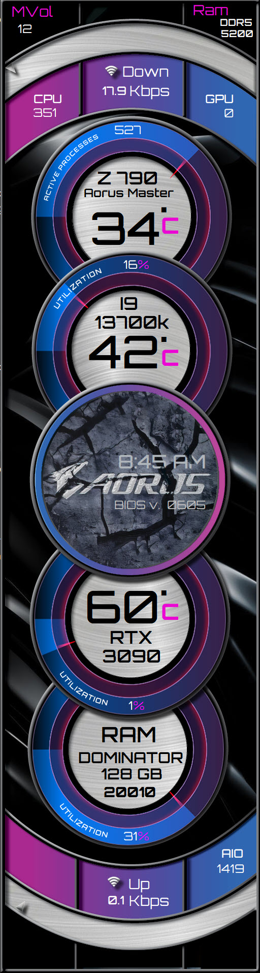
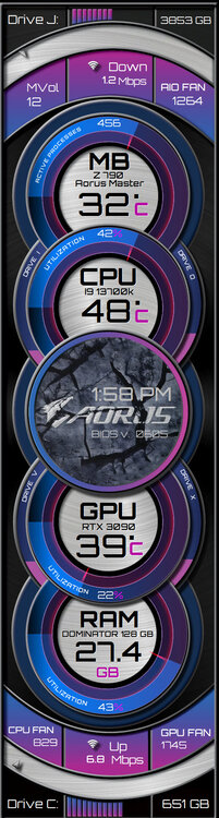
Working on another panel. This one's 515 x 1920. Thoughts? Gauges and design inspiration from others, although I can't find the original sources. If anyone wants a copy, please message me. Its a work in progress.
-
There is really something wrong with you. This site is for sharing ideas concepts and panels. Not for your vulgar ranting. It's not necessary and really shows off your character. It's not necessary You should be banned from this forum.
-
Yes. He is creative, talented, and sells a quality product. I have used his designs for inspiration in my own. I hope he keeps posting as it's a challenge to recreate and pushes me to learn more and be creative. Yes, I think he proves a point. You don't want to purchase his panels, ok. Give him some credit. His eye for design and work is exceptional!
-
Clean and nice.